


Create React App lets you quickly create React apps with little-to-no build configuration. And this new update gives your app super-powers.
Create React App lets you quickly create React apps with no build configuration.
The version 2.0 was recently announced and its packed with tons of new features.
This post is a guide to using nearly every new feature of the create react app 2.0.
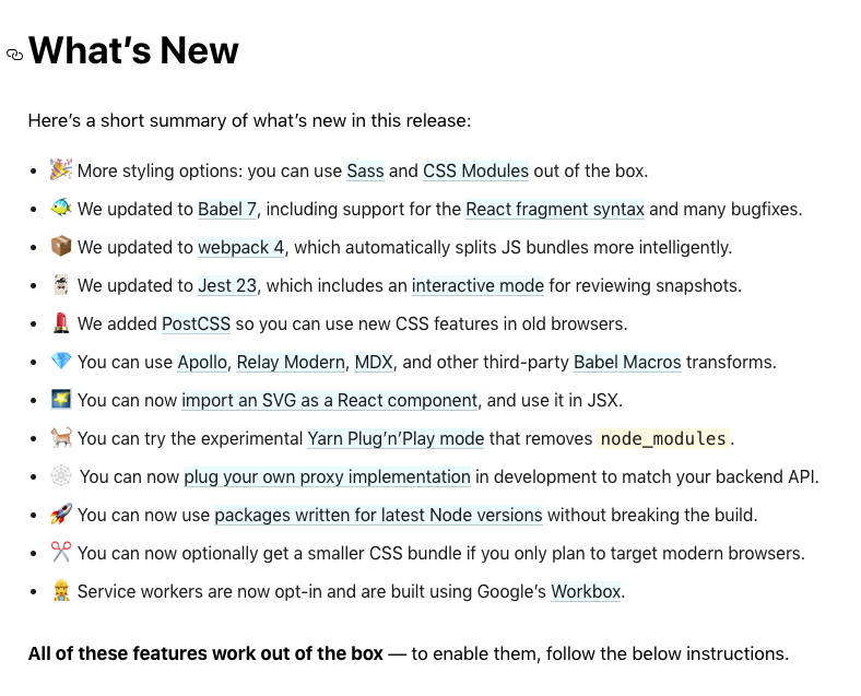
Here's what Facebook said was new in their blog post:
While you're probably familiar with some of the above list, you might be asking, what are these new features, when should I use them, and how do I use them?
Below, we're going to answer all of those questions for each new feature.
What's great about CRA version 2?
While the no-configuration aspect of Create React App makes it easy to get started, there are times where we want to add third-party plugins into our app. This new version let's us easily use:
- SASS support out of the box.
- Support for React Fragment Syntax
- Intelligent JS bundling and splitting via webpack 4
- Interactive mode for Jest 23
- Support for PostCSS
- Babel Macros transforms
- Importing SVG components
- API Proxy implementation
- Service workers with Google’s Workbox
This new version also features updates to the many dependencies that are in create-react-app (e.g. webpack 4, Babel 7, Jest 23).
The GitHub project here contains all the examples used in this article with each branch containing examples for the different features.
Table of Contents
- SASS support out of the box
- Support for React Fragment Syntax
- Intelligent code splitting via webpack 4
- Interactive mode for Jest 23
- Support for PostCSS
- Babel Macros transforms
- Importing SVG components
- API Proxy implementation
- Service workers with Google’s Workbox
- Breaking Changes
- Summary
SASS support out of the box

SASS is a CSS preprocessor that allows the usage of special features such as variables, nested rules and mixins in regular CSS. This results in a simpler and efficient coding process. A CSS preprocessor is a scripting language that extends CSS by allowing developers to write code in one language and then compile it into CSS.
Some of the features that SASS offers includes:
Variables Variables in SASS works like any other programming language. They are used to store values that can be reused later. Things like font sizes, colors and any other CSS value can be stored in a variable. The results in a less bloated stylesheet and saves time.
    $brand-color: #fefefe;
    $brand-font-size: 15px;

    p {
      color: $brand-color;
      font-size: $brand-font-size;
    }
This will result in a compiled CSS like the one below.
p {
  color: #fefefe;
  font-size: 15px;
}
Nesting
Sass allows you to nest your CSS selectors in a way that follows the same visual hierarchy of your HTML. Imagine you have a navigation bar with some links. Ideally, you’d have a nav tag with a ul tag with li children. SASS allows you to write CSS for them like below.
nav {
  ul {
    margin: 0;
    padding: 0;
    list-style: none;
  }

  li {
    display: inline-block;
  }

  a {
    display: block;
    padding: 6px 12px;
    text-decoration: none;
  }
}
The compiled CSS becomes something like this.
nav ul {
  margin: 0;
  padding: 0;
  list-style: none;
}

nav li {
  display: inline-block;
}

nav a {
  display: block;
  padding: 6px 12px;
  text-decoration: none;
}
Imports
The @import directive allows you to import your partial SASS files into one SASS file, to build one single CSS file. Let's say you have a couple of Sass files, _nav.scss and main.scss. We want to import _nav.scss into main.scss
// _nav.scss

nav {
  ul {
    margin: 0;
    padding: 0;
    list-style: none;
  }

  li {
    display: inline-block;
  }

  a {
    display: block;
    padding: 6px 12px;
    text-decoration: none;
  }
}

// main.scss

@import "nav";

body {
  font: 100% Helvetica, sans-serif;
  background-color: #efefef;
}
When importing a SASS file, you don’t need to add the extension as seen above, SASS knows what do automatically. When compiled the code blocks above becomes this.
nav ul {
  margin: 0;
  padding: 0;
  list-style: none;
}

nav li {
  display: inline-block;
}

nav a {
  display: block;
  padding: 6px 12px;
  text-decoration: none;
}

body {
  font: 100% Helvetica, sans-serif;
  background-color: #efefef;
}
Mixins A mixin lets you make groups of CSS declarations that you want to reuse throughout your site. You can even pass in values to make your mixin more flexible. An example can be seen below.
    @mixin transform($property) {
      -webkit-transform: $property;
          -ms-transform: $property;
              transform: $property;
    }

    .box { @include transform(rotate(30deg)); }
The @mixin directive is used to create a SASS mixin. In this case, the name of the mixin is transform. We're also using the variable $property inside the parentheses so we can pass in a transform of whatever we want.
Once the mixin is created, you can then use it as a CSS declaration starting with @include followed by the name of the mixin. The above will result in a complied CSS as seen below.
.box {
  -webkit-transform: rotate(30deg);
  -ms-transform: rotate(30deg);
  transform: rotate(30deg);
}
SASS can be written in two ways in terms of syntax; .scss and .sass.
- SCSS: Uses the
.scssfile extension and is fully compliant with CSS syntax. - SASS: Uses
.sassfile extension and indentation, with no need for opening and closing brackets.
When to use SASS?
SASS becomes really useful when stylesheets are getting larger, more complex, and harder to maintain.
How to use in Create React App 2.0
So how do we use in Create React App 2.0?
First we’ll need to install node-sass locally using the npm package. node-sass is a library that provides binding for Node.js to LibSass, the C version of the popular stylesheet preprocessor, Sass. It allows you to natively compile .scss files to css
npm i node-sass
When the installation is done, you can then proceed to change the src/App.css to src/App.scss and then edit the App.js file with code block below.
// change from App.css to App.scss
import "./App.scss";
What this means is that, all imported .scss or .sass files will be automatically compiled into CSS files. Let’s see this in action.
// App.css
.App {
  text-align: center;
}
.App-logo {
  animation: App-logo-spin infinite 20s linear;
  height: 40vmin;
}
.App-header {
  background-color: #282c34;
  min-height: 100vh;
  display: flex;
  flex-direction: column;
  align-items: center;
  justify-content: center;
  font-size: calc(10px + 2vmin);
  color: white;
}
.App-link {
  color: #61dafb;
}
@keyframes App-logo-spin {
  from {
    transform: rotate(0deg);
  }
  to {
    transform: rotate(360deg);
  }
}
As seen in the code block above, all of the CSS selectors all share a prefix of App, let’s make this more structured by using SASS nesting. This will result in the code block below.
// App.scss
.App {
  text-align: center;
  &--logo {
    animation: App-logo-spin infinite 20s linear;
    height: 40vmin;
  }
  &--header {
    background-color: #282c34;
    min-height: 100vh;
    display: flex;
    flex-direction: column;
    align-items: center;
    justify-content: center;
    font-size: calc(10px + 2vmin);
    color: white;
  }
  &--link {
    color: #61dafb;
  }
}
@keyframes App-logo-spin {
  from {
    transform: rotate(0deg);
  }
  to {
    transform: rotate(360deg);
  }
}
We’re using the Sass Ampersand (&) to create better nesting rules and a better readable code. This also means we’d have to update our classnames in App.js.
// src/App.js
import React, { Component } from "react";
import logo from "./logo.svg";
import "./App.scss";
class App extends Component {
  render() {
    return (
      <div className="App">
        <header className="App--header">
          <img src={logo} className="App--logo" alt="logo" />
          <p>
            Edit <code>src/App.js</code> and save to reload.
          </p>
          <a
            className="App--link"
            href="https://reactjs.org"
            target="_blank"
            rel="noopener noreferrer"
          >
            Learn React
          </a>
        </header>
      </div>
    );
  }
}
export default App;
The codebase for this example above can be seen on GitHub here.
To Learn More
See:
- SASS’ homepage.
- React documentation on how to use SASS in Create React App 2.0
Support for React Fragment Syntax
React Fragments is a feature that was originally released last year with React v16.2.0. It allows us to easily return multiple elements in a component without adding extra nodes.
So let’s say we had a component with multiple elements to return, we’d have to do it like the code block below; by adding another unnecessary div as a parent container.
render() {
  return (
    <div>
      <ChildA />
      <ChildB />
      <ChildC />
    </div>
  );
}
But with the introduction of React Fragment, we could do something like the the code block below.
render() {
  return (
    <React.Fragment>
      <ChildA />
      <ChildB />
      <ChildC />
    </React.Fragment>
  );
}
When to use React Fragments?
React Fragments can be used when the wrapper <div> is not needed and is messing with the layout of your React app.
How to use in Create React App 2.0
Now, with Create React App, React Fragments can be written with a shorter syntax. It looks like empty tags.
render() {
  return (
    <>
      <ChildA />
      <ChildB />
      <ChildC />
    </>
  );
}
You can use <></> the same way you’d use any other element except that it doesn’t support keys or attributes.
The codebase for this example above can be seen on GitHub here.
To Learn More
See:
Intelligent code splitting via webpack 4

When building React applications, it's very common to see the size of the app grow -- largely due to the number of dependencies in use.
This happens when a section of the app (or route) might import a large number of components that are not necessary when it first loads. Having too many dependencies can unnecessarily increase the initial load time of the app.
So how do we fix this? How do we make sure that the app only loads what is needed?
Code splitting.
Code splitting is a great way to optimize your React app, as it splits your code at logical breakpoints, and then loading it once the user has done something that requires that piece of code.
This speeds up the initial load of the application and lightens its overall weight, as some blocks may never even be loaded.
When to use code splitting?
Code splitting is great when you need to keep an eye on the code you are including in your bundle so that you don’t accidentally make it so large that your app takes a long time to load.
How to use in Create React App 2.0
There’s no major change to how you can use code splitting in Create React App 2.0 as most of the changes were made under the hood (by upgrading to webpack 4). It’s the same method as it was in the previous version.
However, let’s see a simple example of how code splitting is carried out in a React app.
In a React app, code splitting can be achieved by using the import() syntax and Webpack.
Even better, you can use react-loadable, which is a higher order component for loading components with dynamic imports. React Loadable is a small library that makes component-centric code splitting incredibly easy in React.
Check out the code-splitting branch of the GitHub project and navigate to the index.js file in the routes folder (src/routes/index.js). Or, you can view the file online here.
At the beginning of the file, you’ll see a few imports statements. They are basically modules being imported to be used in the code.
// src/routes/index.js
import React, { Component } from "react";
import { BrowserRouter as Router, Route, Switch, Link } from "react-router-dom";
import Loadable from "react-loadable";

import createBrowserHistory from "history/createBrowserHistory";
const history = createBrowserHistory();

const LoaderComponent = () => {
  return (
    <>
      <div className="container">
        <p>Loading</p>
      </div>
    </>
  );
};
As you can see above, Loadable is imported from react-loadable, and it will be used to carry out code splitting. The LoaderComponent component renders a view that will be used as loader while the view is being fetched.
Loadable is a higher-order component (a function that creates a component) which lets you dynamically load any module before rendering it into your app. In the code block below, the loader uses the import function to dynamically import a particular component to be loaded and the LoaderComponent component is used for the loading state. delay is the time to wait (in milliseconds) before passing props.pastDelay to your loading component. This defaults to 200.
// src/routes/index.js
const AsyncHome = Loadable({
  loader: () => import("../components/Home"),
  loading: LoaderComponent
});
const AsyncAbout = Loadable({
  loader: () => import("../components/About"),
  loading: LoaderComponent,
  delay: 5000
});
const AsyncContact = Loadable({
  loader: () => import("../components/Contact"),
  loading: LoaderComponent,
  delay: 5000
});
const AsyncNotFound = Loadable({
  loader: () => import("../components/NotFound"),
  loading: LoaderComponent
});
The components above can then be used in the routes like this.
// src/routes/index.js
<Switch>
  <Route exact path="/" component={AsyncHome} />
  <Route path="/about" component={AsyncAbout} />
  <Route path="/contact" component={AsyncContact} />
  <Route path="*" component={AsyncNotFound} />
</Switch>
The codebase for this example above can be seen on GitHub here.
To Learn More
See:
- react-loadable’s documentation.
- React’s documentation on code splitting.
- Create React App’s documentation on code splitting.
Interactive mode for Jest 23

Jest is a JavaScript testing tool created by Facebook to test React apps or basically any JavaScript app. It comes with a test runner, assertion library, and has support for mocking.
The latest version, Jest 23 is a major upgrade and includes the interactive Snapshot mode which allows you to step through each failing snapshot in each failing suite to review your failed snapshots and choose to update or skip each individually.
How to use in Create React App 2.0
Create React App already ships with Jest, however you’ll need to install react-test-renderer for rendering snapshots.
npm i -D react-test-renderer
We’ll be creating a snapshot test for a Link component that renders hyperlinks. Create a Link.js file in the src folder.
// Link.js
import React from "react";
const STATUS = {
  HOVERED: "hovered",
  NORMAL: "normal"
};
export default class Link extends React.Component {
  constructor(props) {
    super(props);
    this._onMouseEnter = this._onMouseEnter.bind(this);
    this._onMouseLeave = this._onMouseLeave.bind(this);
    this.state = {
      class: STATUS.NORMAL
    };
  }
  _onMouseEnter() {
    this.setState({ class: STATUS.HOVERED });
  }
  _onMouseLeave() {
    this.setState({ class: STATUS.NORMAL });
  }
  render() {
    return (
      <a
        className={this.state.class}
        href={this.props.page || "#"}
        onMouseEnter={this._onMouseEnter}
        onMouseLeave={this._onMouseLeave}
      >
        {this.props.children}
      </a>
    );
  }
}
Jest automatically picks up any file that ends in .test.js or .spec.js as a test file so create a file named Link.test.js. That’s where the test will be carried out.
// Link.test.js
import React from "react";
import Link from "./Link";
import renderer from "react-test-renderer";

test("Link changes the class when hovered", () => {
  const component = renderer.create(
    <Link page="http://www.facebook.com">Facebook</Link>
  );
  let tree = component.toJSON();
  expect(tree).toMatchSnapshot();
  // manually trigger the callback
  tree.props.onMouseEnter();
  // re-rendering
  tree = component.toJSON();
  expect(tree).toMatchSnapshot();
  // manually trigger the callback
  tree.props.onMouseLeave();
  // re-rendering
  tree = component.toJSON();
  expect(tree).toMatchSnapshot();
});
If you run the npm test command you get to see a message from Jest on the terminal that all tests passed.

However, to see the interactive mode in action we need to trigger a failed snapshot and that can be done by editing the Link.js file with code below.
      _onMouseEnter() {
        // this.setState({class: STATUS.HOVERED});
      }
You can then see the interactive mode option on the terminal which you can use by pressing i.
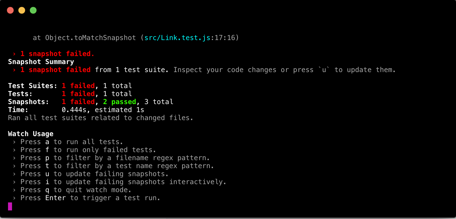
Once you enter Interactive Snapshot Mode, Jest will step you through the failed snapshots one test at a time and give you the opportunity to review the failed output. Any change to the test file and it’s source file will update the snapshot and results in the terminal automatically.
To Learn More
See:
- Create React App’s documentation on testing.
- Interactive mode in Jest 23.
Support for PostCSS

PostCSS is a tool for transforming styles with JS plugins. These include plugins that can help lint your CSS, support variables and mixins, transpile future CSS syntax, inline images, and more.
One of the most popular PostCSS plugin is Autoprefixer. It allows us to write modern CSS because it helps to make sure the CSS is compatible with browsers as it adds vendor prefixes to CSS declarations.
PostCSS in Create React App 2.0 minifies your CSS and adds vendor prefixes to it automatically through Autoprefixer so you don’t need to worry about it.
It also automatically polyfills CSS features like:
allpropertybreakproperties- custom properties, and
- media query ranges so as add support for older browsers.
How to use in Create React App 2.0
PostCSS is already built in the production build so you don’t have to do anything here.
To Learn More
See:
- PostCSS on GitHub
- Autoprefixer
- Create React App’s documentation on Post-Processing CSS.
Babel Macros transforms

Babel macros transforms are a way of writing Babel transforms right in your project’s code without having to create a babel.rc file or make changes to a webpack config file. This allows us to import Babel plugins directly in code and use them. This results in a more explicit transformation and a zero config way of using babel plugins.
The babel-plugin-macros tool allows us to do exactly just that. It enables you to have zero-config, importable code transformations.
How to use in Create React App 2.0
To use this tool in Create React App 1 would have required ejecting -- but not any more! In Create React App 2 it ships by default.
Let’s do a short example by using Babel Macro transforms for emotion. Emotion is a CSS-in-JS library that allows us to write performant and flexible CSS. To get started, we’d need to install emotion
npm i emotion
To use the babel transform for emotion, all you have to do is add /macro to the end of the emotion import like below.
// App.js

import React, { Component } from "react";
import { css } from "emotion/macro";
import logo from "./logo.svg";
import "./App.css";

const className = css`
  color: hotpink;
`;
class App extends Component {
  render() {
    return (
      <div className="App">
        <header className="App-header">
          <img src={logo} className="App-logo" alt="logo" />
          <p className={className}>
            Edit <code>src/App.js</code> and save to reload.
          </p>
          <a
            className="App-link"
            href="https://reactjs.org"
            target="_blank"
            rel="noopener noreferrer"
          >
            Learn React
          </a>
        </header>
      </div>
    );
  }
}
export default App;
The advantage of using emotion’s babel transform is that it doesn’t require processing the CSS declaration strings into a AST, which will inevitably add to the startup time of your application, especially if you have many CSS declarations.
If we were to have done this in Create React App 1, we’d have had to eject the app and add babel-plugin-macros to your babel config.
You can switch to the babel-macros branch on the GitHub repo to see the complete demo.
Learn more
See:
- Babel Macros on the Babel blog.
Importing SVG components
In Create React App 2.0, SVG components can be imported as React components. This can be useful if you don't want to load an SVG as a separate file.
Let’s look at an example below. Open up the src/App.js file and edit with the code below.
// App.js
import React, { Component } from "react";
// this let's React know that we are trying to import the SVG as a component
import { ReactComponent as Logo } from "./logo.svg";
import "./App.css";
class App extends Component {
  render() {
    return (
      <div className="App">
        <header className="App-header">
          {/* Logo can then be used as a React component here */}
          <Logo className="App-logo" />
          <p>
            Edit <code>src/App.js</code> and save to reload.
          </p>
          <a
            className="App-link"
            href="https://reactjs.org"
            target="_blank"
            rel="noopener noreferrer"
          >
            Learn React
          </a>
        </header>
      </div>
    );
  }
}
export default App;
The ReactComponent import name used in the code block tells React that we’d like to import the SVG as a React component. Now we can use the tag
The codebase for this example above can be seen on GitHub here.
To Learn More
See:
- Create React App’s documentation on importing SVGs.
API Proxy implementation
API proxying can come useful when the backend app and frontend app (in this case a React app) are on the same host and port. So let’s say we have a Node + Express server that we can make API calls. Ideally, that means, you’d make API calls like this:
fetch("localhost:8080/users")
  .then(res => {
    return res.json();
  })
  .then(res => {
    console.log(res);
  });
With the API proxy implementation, you can, however, make this easier by telling the development server to proxy any unknown requests to your API server in development. This can be done (in Create React App 1) by adding a proxy field to your package.json, as seen below:
    // package.json

    "proxy": "http://localhost:8080/"
And then you can rewrite the API call above like the one below.
fetch("/users")
  .then(res => {
    return res.json();
  })
  .then(res => {
    console.log(res);
  });
Coincidentally, this can help avoid CORS issues in development.
How to use in Create React App 2.0
Create React App 2.0 even makes this better by making it possible to get direct access to the Express app instance and hook up your own proxy middleware.
To do that you’ll need to install the http-proxy-middleware package.
npm i http-proxy-middleware
With that done, the next would be to create a src/setupProxy.js file and edit with the code block below.
const proxy = require("http-proxy-middleware");

module.exports = function(app) {
  app.use(proxy("/api", { target: "http://localhost:5000/" }));
};
Now let’s create a simple service in the React app that fetches data from the API.
First we’ll need to create the actual Node + Express app that will serve as the API. Create a server.js file in the root of the project and edit with the code block below.
const express = require("express");
const app = express();
app.set("port", 5000);
app.get("/", (req, res) => {
  res.send("Welcome to Node + Express API");
});
const USERS = [
  {
    id: 0,
    name: "Yomi Eluwande"
  },
  {
    id: 1,
    name: "Nate Murray"
  },
  {
    id: 2,
    name: "Sophia Shoemaker"
  }
];
app.get("/api/users", (req, res) => {
  res.send(USERS);
});
app.listen(app.get("port"), () => {
  console.log("Node app is running on port", app.get("port"));
});
We are setting up a minimal Express app and returning an array of users whenever the /api/user route is called. We’ll also need to update the package.json file so as to accommodate the Node app. We’re using the npm-run-all package which allows you to run multiple npm scripts in parallel.
    "scripts": {
        "start:client": "react-scripts start",
        "start:server": "nodemon server.js",
        "start": "npm-run-all --parallel start:*",
        "build": "react-scripts build",
        "test": "react-scripts test",
        "eject": "react-scripts eject"
      },
Next we’ll install the dependencies needed for the Express API.
npm i express npm-run-all
Finally, the src/App.js will be edited with the addition of the code block below.
    componentDidMount () {
        fetch('/api/users')
        .then(res => {
          return res.json()
        })
        .then(response => {
          console.log(response)
        })
      }
In the code above, we’re simply making an API call to the Express app and logging the response to the console.
The added advantage of using this method of proxying is that it allows you to use globbing and/or pattern matching on the path, which is more flexible than the express route matching in v1.
The codebase for this example above can be seen on GitHub here.
To Learn More
See:
- Create React App’s documentation on API proxying.
Service workers with Google’s Workbox

A service worker is a script that your browser runs in the background, separate from the web page, opening the door to features that don’t need a web page or user interaction.
Service workers are installed on the device from which the website is accessed from and they allow you to control how network requests from your page are handled. In this case, we are using service workers to cache the site’s content and resources resulting in a faster and more usable app.
How to use in Create React App 2.0
Service workers are not new in Create React App but what’s new about them in version 2.0 is the fact that the offline/cache-first behavior is an opt-in feature as opposed to v1, where it was enabled by default.
To opt in, all you have to do is open the src/index.js file and change the serviceWorker.unregister(); line of code to serviceWorker.register();
The decision to make offline/cache-first behavior an opt-in feature is because it can cause debugging problems in deployments as seen here.
Google’s Workbox is used to generate the service worker file that takes care of precaching all local assets and updating them as you deploy updates. The service worker employs a cache-first strategy for all assets and navigation requests resulting in a faster web app.
To Learn More
See:
- An Introduction to Service Workers.
- Create React App’s documentation on Service Workers.
Breaking Changes
Some of the breaking changes in Create React App 2.0 are listed below.
- Node 6 is no longer supported.
- Support for older browsers (such as IE 9 to IE 11) is now opt-in with a separate package.
- Code-splitting with
import()now behaves closer to specification, whilerequire.ensure()is disabled. - PropTypes definitions are automatically stripped out of the production builds.
So if these apply to you, take that into consideration before upgrading.
Summary
Create-react-app version 2 adds tons of great features in a painless way. We'd like to thank the create-react-app contributors for all of their hard work in making React easier to use for everyone!
You can read more about the new version of Create React App here.

Learn React the right way
The up-to-date, in-depth, complete guide to React and friends.
Download the first chapter