The Syncfusion Vue UI component library is the only suite that you will ever need to build an application because it contains over 70 high-performance, lightweight, modular, and responsive UI components in a single package.
Now, it includes a new Skeleton component as part of the 2022 Volume 3 release.
Let’s explore the features of the new Vue Skeleton component and its UI design with code examples.
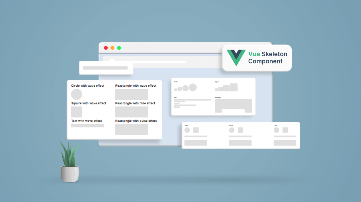
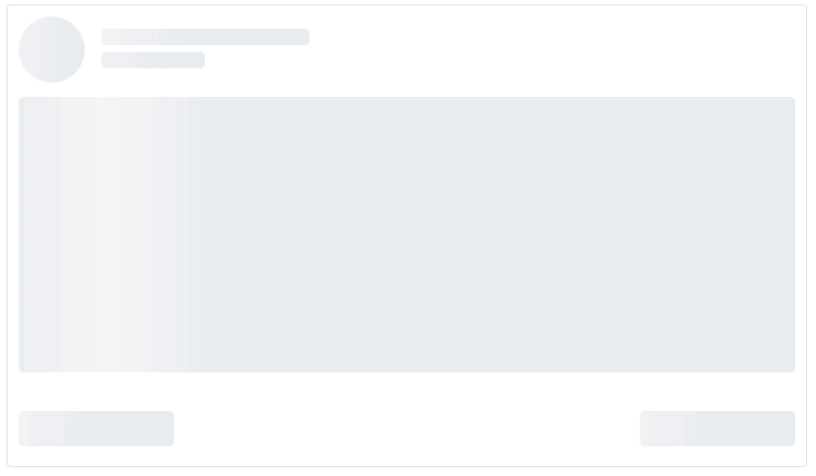
Skeleton overview
The Skeleton component is a modern data loading indicator that shows a preview of the content. While the interface is loading data, the component displays a layout of how the content will appear with a shimmer effect. The user will be aware of the content layout and understand that the UI is loading, resulting in an improved user experience.
Use cases
The following are a few places where the Skeleton component can be a great fit:
- Loading dynamic content on a page: Users expect pages to load fast in news feeds and social media posts. However, such feeds do not always perform well since they contain unique content every time the page is visited. The Skeleton component can be extremely helpful in maintaining the page layout until the actual content is loaded.
- Performing data operations in the background: A grid control primarily involves data handling and may take some time to load data from a server. In this scenario, the Skeleton can maintain the layout while the server loads the data.
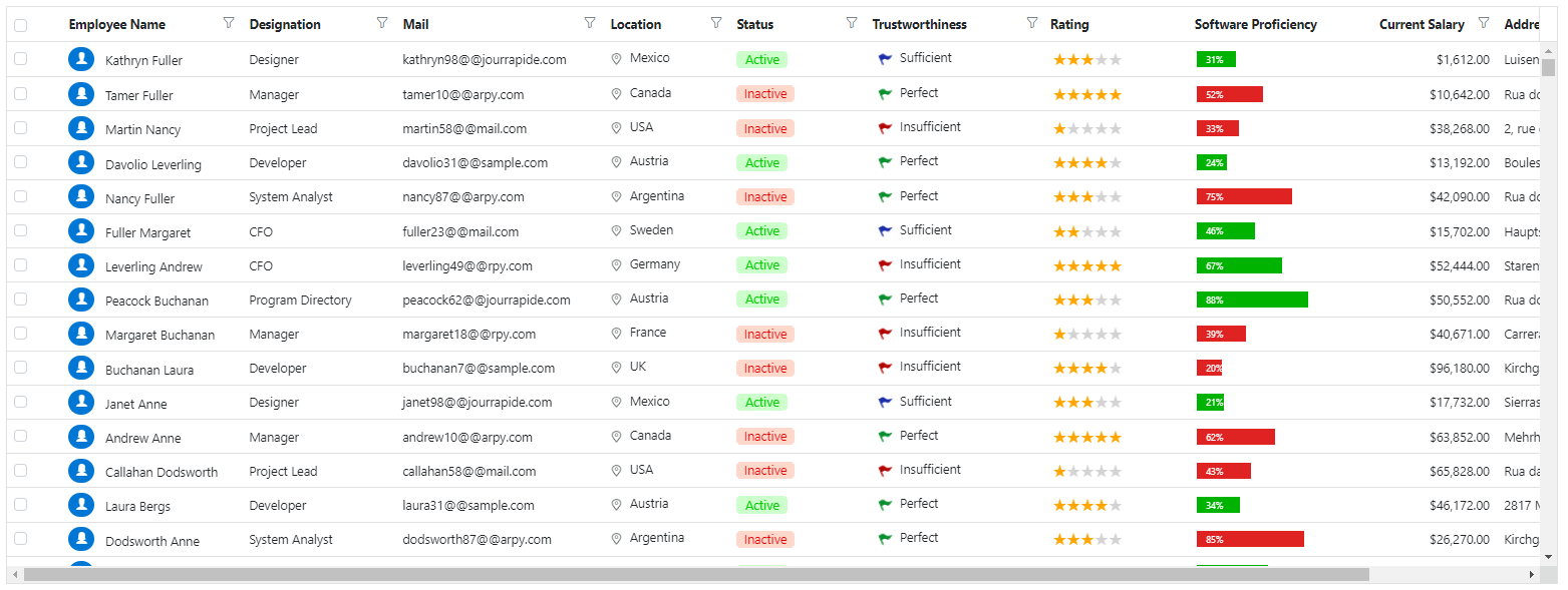

Vue DataGrid with Skeleton Component
Note: To see a loading indicator that is similar to the Skeleton component in a data grid, refer to the Vue DataGrid Loading Animation demo.
Key features
The Vue Skeleton component has built-in support for the following features:
- Different shapes.
- Multiple shimmer (animation) effects.
- Options to control its size and visibility.
Shape options
We can display page content in various shapes depending on the use case. Therefore, the placeholder for such content should also match the content shapes. The built-in content shapes of the Skeleton component meet this requirement. The component supports the following content shapes:
- Circle
- Rectangle
- Square
- Text (represents a single line of text).
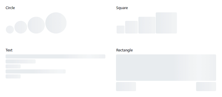
Note: For more details, refer to the Vue Skeleton component default functionalities demo with different shapes.
Shimmer effects
Different animation styles can fit the different types of pages you deliver, so we provided the following built-in shimmer (animation) effects:
- Wave
- Pulse
- Fade
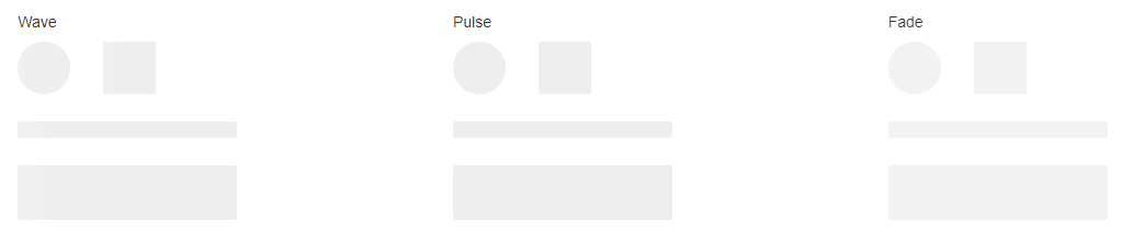
Note: For more details, refer to the Vue Skeleton animation demo.
Size and visibility
To customize the Skeleton’s size and toggle between the actual content and the placeholder, the component provides the following properties:
- height: Defines the height of rectangle and text shapes.
- width: Defines the width of rectangle and text shapes, the side of the square shape, and the radius of the circle shape.
- visible: Toggles the visibility of the Skeleton component.
Ease of use
The Vue Skeleton component contains a minimal API for easy integration. You can easily add it to any element as a CSS component.
The Skeleton component size can be responsive or static, providing you more flexibility in creating the content layout.
Getting started with the Vue Skeleton component
Now that we have seen the features of the Vue Skeleton component, let’s see the steps to configure it in your Vue 3 applications.
Step 1: Create a Vue application.
First, ensure you have all the prerequisites needed to run a Vue 3 app. Then, create a Vue app using the Vue CLI.
Step 2: Add Syncfusion NPM packages to the app.
Syncfusion Vue packages are available in the NPM registry. To install the packages required for the Skeleton component, use the following command:
npm install @syncfusion/ej2-vue-notifications --save
Step 3: Add CSS reference for Syncfusion Vue components.
Now, import the required CSS styles for the Skeleton component and dependency styles in the <style> section of the src/App.vue file. Refer to the following code.
<style>
  @import "../node_modules/@syncfusion/ej2-base/styles/material.css";
  @import "../node_modules/@syncfusion/ej2-vue-notifications/styles/material.css";
</style>
Step 4: Add the Syncfusion Vue Skeleton component to your app.
We have completed all the necessary configurations for rendering the Syncfusion Vue components. Now, let’s add the Skeleton component by following these steps:
- Import the Skeleton component in the <script> section of the src/App.vue file.
<script> import { SkeletonComponent } from "@syncfusion/ej2-vue-notifications"; </script> - Register the Skeleton component in your app as shown in the following code.
Import { SkeletonComponent } from ‘@syncfusion/ej2-vue-notifications’; export default { name: “App”, components: { ‘ejs-skeleton’: SkeletonComponent } } - Add the component definition in the template section.
<template>
 <div id='element'>
  <ejs-skeleton height='15px' width=’200px’></ejs-skeleton>
 </div>
</template>
Summarizing the above steps, update the src/App.vue file with the following code.
<template>
 <div id='element'>
  <ejs-skeleton height='15px' width=’200px’></ejs-skeleton>
 </div>
</template>

<script>
 import { SkeletonComponent } from '@syncfusion/ej2-vue-notifications';
 // Component Registration
 export default {
   name: "App",
   components: {
     'ejs-skeleton': SkeletonComponent
   }
 }
</script>
<style>
  @import "../node_modules/@syncfusion/ej2-base/styles/material.css";
  @import "../node_modules/@syncfusion/ej2-vue-notifications/styles/material.css";
</style>
Step 5: Run the app.
Finally, run the application using the following command.
npm run serve
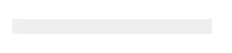
Once the web server is loaded, you can find the following output by opening the Vue app in the browser at port localhost:8080. Also, you can easily customize the shape and shimmer effect using the shape and shimmerEffect properties, respectively.
Adding the Syncfusion Vue Skeleton as a CSS component
First, follow steps 1 through 3 in the previous section.
Note: You can also download and reference the Skeleton styles from our Theme Studio.
Next, follow these steps to add the Vue Skeleton as a CSS component in your application:
- Define the element for adding the Skeleton component.
<div id="skeleton "></div>
- Add the CSS class “e-skeleton” to initialize the Vue Skeleton component in the element.
<div id= "skeleton" class="e-skeleton"></div>
- To define the Skeleton shape, add the CSS class “e-skeleton-{shape}“, where {shape} represents the shape name. For example, “e-skeleton-circle” is for a circle shape.
<div id="skeleton" class="e-skeleton e-skeleton-circle"></div>
- To define the shimmer effect, add the CSS class “e-skeleton-{effect}“, where {effect} represents the shimmer effect name. For example, “e-skeleton-wave” is for wave effect.
<div id="skeleton" class="e-skeleton e-skeleton-circle e-skeleton-wave"></div>
- Now, add the styles for the height and width of the Skeleton component.
<div id="skeleton" class="e-skeleton e-skeleton-circle e-skeleton-wave" style="height:50px; width:50px;"></div>
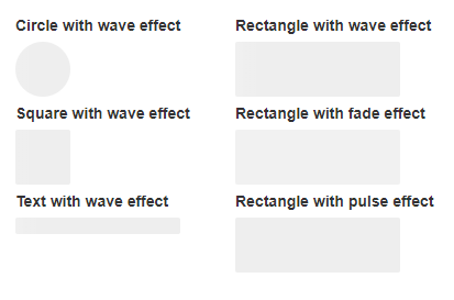
Refer to the following code block for the CSS classes corresponding to all Skeleton shapes and shimmer effects.
<div style="width: 200px;display:inline-block;">
 <label> Circle with wave effect</Label>
  <div class="e-skeleton e-skeleton-circle e-shimmer-wave" style="height:50px;width:50px;"></div>
  <br/>
 <label> Square with wave effect</Label>
  <div class="e-skeleton e-skeleton-square e-shimmer-wave" style="height:50px;width:50px;"></div>
  <br/>
 <label> Text with wave effect</Label>
  <div class="e-skeleton e-skeleton-text e-shimmer-wave" style="height:15px;width:150px;"></div>
</div>
<div style="width: 200px;display:inline-block;">
 <label> Rectangle with wave effect</Label>
  <div class="e-skeleton e-skeleton-rectangle e-shimmer-wave" style="height:50px;width:150px;"></div>
  <br/>
 <label> Rectangle with fade effect</Label>
  <div class="e-skeleton e-skeleton-rectangle e-shimmer-fade" style="height:50px;width:150px;"></div>
  <br/>
 <label> Rectangle with pulse effect</Label>
  <div class="e-skeleton e-skeleton-rectangle e-shimmer-pulse" style="height:50px;width:150px;"></div>
  <br/>
</div>
Run the application
Finally, run the application using the following command.
npm run serve
Once the web server is loaded, you can find the following output by opening the Vue app in the browser at port localhost:8080.
References
For more details, refer to the Vue Skeleton component demos and documentation.
Supported platforms
The Skeleton component is also available in the following platforms.
Conclusion
Thanks for reading! In this blog, we have seen the features of the new Syncfusion Vue Skeleton component that rolled out in the 2022 Volume 3 release and the steps to getting started with it. Try out this component yourself and provide your feedback in the comments section below.
Also, check out our Release Notes and the What’s New pages to see the other features available in the 2022 Volume 3 release.
For existing customers, the new version is available for download from the License and Downloads page. If you are not yet a Syncfusion customer, you can try our 30-day free trial to check out our available features.
You can also reach us through our support forums, support portal, or feedback portal. As always, we are happy to assist you!