The Syncfusion JavaScript Linear Gauge control is primarily used to show gauge-ish values like temperatures, quantities, speed—numbers on a linear scale across a range. In this sample, we wanted to see if we could make a package delivery timeline or progress bar. The finished sample is in GitHub.
The following image shows a simple linear gauge from our online samples. The larger tick marks display values, and there is a pointer with a text label.
This sample is mildly interesting, but it’s not quite right to indicate shipping status (the unit of measurement should be a percentage, at least). To fix it, we take advantage of the customizations allowed in the Syncfusion API.
In our GitHub sample, we made a basic shipping status bar, but it was a little boring. So, we put it on the bottom of the sample page (linear3) and led with more interesting options. Balloons are always fun, so we made the others with balloons!
We demonstrate different looks across the three gauges. Each gauge is linear with max = 150 and min = 0. We defined four markers at 0, 50, 100, and 150 to represent four stages. We used the marker pointer and took advantage of the color property to show finished, unfinished, and current values:
- NotStarted: Stage has not been reached or started.
- Current: Where the package is located now.
- Finished: When the package has reached the destination.
public FinishedColor: string = '#f2a92f';
public NotStartedColor: string = '#eeeeee';
public CurrentActionColor: string = '#79564e';
To make the samples interactive, we added a numeric text box with a spinner. Users can change the value and see it reflected in the gauges.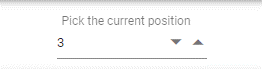
The numerictextbox change event calls the positionChange function. Within the positionChange function, we are changing colors for the pointer and range, as well as the image for each pointer. Changing all this is how the users see progression. There are six cases in this function and only four values on the gauge. Since we defined three colors for each marker (NotStarted, Current, and Finished), we had to handle NotStarted and Finished for the first point and the last point, respectively.
public positionChange(args: ChangeEventArgs) {
  switch (args.value) {
    case 0:
      this.updatePointerImage( this.NotStartedPointer, this.NotStartedPointer, this.NotStartedPointer, this.NotStartedPointer );
      this.updatePointerColor( this.NotStartedColor, this.NotStartedColor, this.NotStartedColor, this.NotStartedColor );
      this.updateRangeColor( this.NotStartedColor, this.NotStartedColor, this.NotStartedColor );
      break;
    case 1:
      this.updatePointerImage( this.CurrentActionPointer, this.NotStartedPointer, this.NotStartedPointer, this.NotStartedPointer );
      this.updatePointerColor( this.CurrentActionColor, this.NotStartedColor, this.NotStartedColor, this.NotStartedColor );
      this.updateRangeColor(this.NotStartedColor, this.NotStartedColor, this.NotStartedColor);
      break;
    case 2:
      this.updatePointerImage( this.FinishedPointer, this.CurrentActionPointer, this.NotStartedPointer, this.NotStartedPointer );
      this.updatePointerColor( this.FinishedColor, this.CurrentActionColor, this.NotStartedColor, this.NotStartedColor );
      this.updateRangeColor(this.FinishedColor, this.NotStartedColor, this.NotStartedColor);
      break;
    case 3:
      this.updatePointerImage( this.FinishedPointer, this.FinishedPointer, this.CurrentActionPointer, this.NotStartedPointer );
      this.updatePointerColor( this.FinishedColor, this.FinishedColor, this.CurrentActionColor, this.NotStartedColor );
      this.updateRangeColor(this.FinishedColor, this.FinishedColor, this.NotStartedColor);
      break;
    case 4:
      this.updatePointerImage(this.FinishedPointer, this.FinishedPointer, this.FinishedPointer, this.CurrentActionPointer );
      this.updatePointerColor(this.FinishedColor, this.FinishedColor, this.FinishedColor, this.CurrentActionColor );
      this.updateRangeColor(this.FinishedColor, this.FinishedColor, this.FinishedColor);
      break;
    case 5:
      this.updatePointerImage( this.FinishedPointer, this.FinishedPointer, this.FinishedPointer, this.FinishedPointer );
      this.updatePointerColor( this.FinishedColor, this.FinishedColor, this.FinishedColor, this.FinishedColor );
      this.updateRangeColor(this.FinishedColor, this.FinishedColor, this.FinishedColor);
      break;
    default:
      break;
  }
}
The default axis labels are numbers. This makes sense, as a gauge is meant to show numbers. We took the render event for the axis labels and used it to change the labels to text.
//Provides label name for each stage
public axisLabelRender(args: IAxisLabelRenderEventArgs):void {
  if (args.value === 0) {
    args.text = 'Stage 1';
  } else if (args.value === 50) {
    args.text = 'Stage 2';
  } else if (args.value === 100) {
    args.text = 'Stage 3';
  } else if (args.value === 150) {
    args.text = 'Stage 4';
  } else {
      //prevents rendering of default label for second axis
    args.cancel = true;
  }
}
<ejs-lineargauge id="linear1" #gauge1 height="200px" title="Stage Progression" orientation="Horizontal"
      (axisLabelRender)="axisLabelRender($event)">
First gauge
Since the Linear Gauge control can have multiple axes, we created a second one to make the balloons float above the gauge. This lets us keep the first axis as circles with checks. You are free to put markers anywhere on this axis you wish; we just chose to keep them synchronized.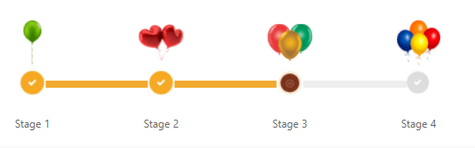
<!-- second axis to add images in the UI for each stage-->
<e-axis minimum="200" maximum="350" [line]='axisline' [minorTicks]="minorTick" [majorTicks]="majorTick">
    <e-pointers>
        <e-pointer type="Marker" markerType="Image" value="200" offset="-10" [imageUrl]="Stage1" height=50 width=50>
        </e-pointer>
        <e-pointer type="Marker" markerType="Image" value="250" offset="-10" [imageUrl]="Stage2" height=50 width=50>
        </e-pointer>
        <e-pointer type="Marker" markerType="Image" value="300" offset="-10" [imageUrl]="Stage3" height=50 width=50>
        </e-pointer>
        <e-pointer type="Marker" markerType="Image" value="350" offset="-10" [imageUrl]="Stage4" height=50 width=50>
        </e-pointer>
    </e-pointers>
</e-axis>
Second gauge
We set the markers to be images and put balloons on them, using only one axis. These balloons could have been offset, but then the gauge wouldn’t be a flat line. You can play with the sample to make this happen though.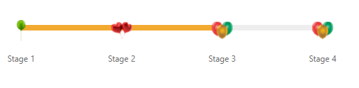
<e-pointers>
    <e-pointer type="Marker" markerType="Image" value="0" [imageUrl]="Stage1" height=30 width=30></e-pointer>
    <e-pointer type="Marker" markerType="Image" value="50" [imageUrl]="Stage2" height=30 width=30></e-pointer>
    <e-pointer type="Marker" markerType="Image" value="100" [imageUrl]="Stage3" height=30 width=30></e-pointer>
    <e-pointer type="Marker" markerType="Image" value="150" [imageUrl]="Stage4" height=30 width=30></e-pointer>
</e-pointers>
Third gauge
Here is the actual shipping status progress bar. We decided not to show a marker for the point value 100 (the third stage). This gives the idea of the package being in transit with no particular location defined. We also changed the stage names so that they made sense.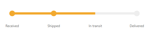
This is a simple example of how one Syncfusion control can be customized. We put a lot of effort into making our controls flexible. If you have any questions about how to create a control, ask us in the comment section below or through our support forums, support portal, or feedback portal. We may be able to create a sample. This is how we grow our suite of products. We look forward to your suggestions!
GitHub reference
You can check out our full example of how to build a JavaScript progress bar.