How many times have you seen people making mistakes while entering dates? It is mostly due to the lack of clarity in the UI as to format.
The Syncfusion Angular DatePicker provides mask support to improve the user experience while entering dates by providing month, day, and year fields. These help users enter valid dates in the correct format and also keep them from entering invalid input dates.
For example, if you enter 6 (June) in the month field, then you can enter only dates from 1 to 30 in the day field. The component won’t allow you to enter values above 30.
In this blog post, we will see how to get started with the Angular DatePicker and enable mask support to easily handle dates in it.
Setup Angular environment
Follow these steps to set the angular CLI projects using the Angular CLI tool.
- First, install the latest version of Angular CLI locally in your application using the following command.
npm install -g @angular/cli@latestNote: If you would like to follow and run the application in Angular 8 to 11, you need to replace the CLI command version number with the corresponding Angular version number.
npm install -g @angular/cli@<CLI VERSION>
- Now, create a new Angular project by using the ng new command and navigate to the created project folder. Here, I am naming this Angular project angular-datepicker-mask.
ng new < angular-datepicker-mask>
 cd < angular-datepicker-mask>
- Then, use the following command to install the ej2-angular-calendars npm package locally in the application.
npm install @syncfusion/ej2-angular-calendars --save
Adding Angular DatePicker
Follow these steps to include the Angular DatePicker component in your application.
- The following CSS files are available in the ../node_modules/@syncfusion package folder. This can be referenced in the [src/styles.css] file using the following code.
[styles.scss]@import '../node_modules/@syncfusion/ej2-base/styles/material.css'; @import '../node_modules/@syncfusion/ej2-buttons/styles/material.css'; @import '../node_modules/@syncfusion/ej2-inputs/styles/material.css'; @import '../node_modules/@syncfusion/ej2-popups/styles/material.css'; @import '../node_modules/@syncfusion/ej2-lists/styles/material.css'; @import '../node_modules/@syncfusion/ej2-splitbuttons/styles/material.css'; @import '../node_modules/@syncfusion/ej2-calendars/styles/material.css'; @import '../node_modules/@syncfusion/ej2-angular-calendars/styles/material.css';
- Then, import the DatePicker module into the Angular application (app.module.ts) from the ej2-angular-calendars package. Refer to the following code example.
[app.module.ts]import { NgModule } from '@angular/core'; import { BrowserModule } from '@angular/platform-browser'; import { DatePickerModule } from '@syncfusion/ej2-angular-calendars'; import { AppComponent } from './app.component'; @NgModule({ declarations: [ AppComponent ], imports: [ BrowserModule,DatePickerModule ], providers: [], bootstrap: [AppComponent] }) export class AppModule { }
- Next, define the Angular DatePicker within the component.html file mapped against the templateUrl option in the app.component.ts file.
[app.component.html]<ejs-datepicker></ejs-datepicker>
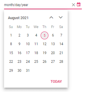
- Now, run the application with the ng serve command and it will display a DatePicker on the browser like in the following screenshot.


Angular DatePicker
Thus, we have included the DatePicker component in our Angular application. Let’s see how to enable the mask support to easily handle dates in the Angular DatePicker.
Enable mask input
You can use the enableMask property to enable the built-in date format masking. By default, the mask pattern is formatted based on the current culture.
To use mask support, inject the MaskedDateTimeService module into the Angular DatePicker.
Refer to the following code example.
[app.component.ts]
import { Component } from '@angular/core';
import { MaskedDateTimeService } from '@syncfusion/ej2-angular-calendars';

@Component({
  selector: 'app-root',
  styleUrls: ['./app.component.scss'],
  templateUrl: './app.component.html',
  providers: [MaskedDateTimeService],
})
export class AppComponent {
  title = 'angular-datepicker-mask';
  public enableMaskSupport: boolean = true;
}[app.component.html]
<div style="width: 300px; margin: auto;">
  <ejs-datepicker [enableMask]="enableMaskSupport">
  </ejs-datepicker>
</div>
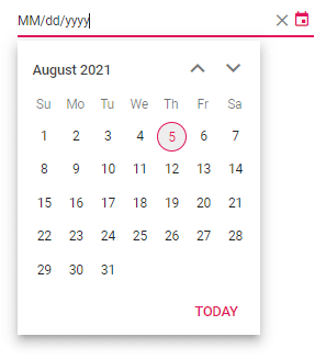
Configure mask placeholder
You can change the mask placeholder value through the maskPlaceholder property. By default, it takes the full name of date and time coordinates such as day, month, year, and hour.
Note: While changing to a culture other than English, ensure that the locale text for the concerned culture is loaded through the load method of the L10n class for mask placeholder values.
Refer to the following code example in which we have customized the default month/day/year format to MM/dd/yyyy.
[app.component.ts]
public maskPlaceholderValue: Object = {day: 'dd', month: 'MM', year: 'yyyy'}[app.component.html]
<div style="width: 300px; margin: auto;">
  <ejs-datepicker [enableMask]="enableMaskSupport" [maskPlaceholder]="maskPlaceholderValue">
  </ejs-datepicker>
</div>
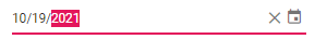
Keyboard accessibility
Also, the mask support in Angular DatePicker provides keyboard interaction to easily handle dates. With this, you can change the values, increments, and decrements of the selected portions of date and time coordinates using the Up and Down arrow keys.
You can also use the Right and Left arrow keys to navigate from one segment to another.
Reference
For more information, refer to the Mask support in Angular DatePicker demos on the web and the GitHub repository.
Conclusion
Thanks for reading! In this blog post, we have seen how to enable the masking feature to easily handle dates in our Angular DatePicker component. This feature helps users enter valid dates in the correct format and avoid data input errors.
Also, try our Angular DatePicker component by downloading a free 30-day trial. Feel free to have a look at the documentation to explore other available features.
If you have any questions, please let us know in the comments section below. You can also contact us through our support forum or Direct-Trac. We are always happy to assist you!