
In this blog post, we will look at the creation of a multicolumn combo box component in Blazor. You will learn how to configure and bind the data in the Syncfusion Blazor ComboBox component to make it display multiple columns of data.
What is a multicolumn combo box?
A standard ComboBox will display a list of items in a single column. So, only a single piece of information about the item can be displayed in an instance.
Example: Displaying a list of product names.
But a multicolumn combo box displays a list of items in multiple columns like in a grid view. So, it is used to display more information regarding an item in a single list.
Example: Let’s suppose a user wants to select a product based on its unit price and the units in stock. In that scenario, they want a multicolumn combo box. This provides a quick and detailed glance at all relevant information about a product. We may also display more information, like units on order and discounts, with multicolumn view support.
Let’s get started creating a multicolumn combo box component in Blazor.
Prerequisites
- Visual Studio 2019
- .NET Core 3.0 or above
Create a Blazor WebAssembly application
In this example, we are going to display the following information regarding the products:
- Product ID
- Name
- Unit price
- Units in stock
- Units on order
Step 1: Create a Blazor WebAssembly app and add the required models and controller classes. We will have three project files created inside this solution:
- Client: Contains the client-side code and the pages that will be rendered on the browser.
- Server: Contains the server-side code, such as DB-related operations and the web API.
- Shared: Contains the shared code that can be accessed by both client and server.
Step 2: Now, create a new model class file inside the Shared project with the name Product. In this class file, we are going to access the Client and Server projects for data binding.
    public class Product
    {
        public int? ProductID { get; set; }
        public string ProductName { get; set; }
        public int? SupplierID { get; set; }
        public double? UnitPrice { get; set; }
        public int UnitsInStock { get; set; }
        public int UnitsOnOrder { get; set; }
    }
Step 3: After creating the model class, add the web API controller to the Server project with the name ProductController. In this controller file, I have included the Get methods to generate appropriate data, which you can reference from this GitHub repository.
    [Route("[controller]")]
    [ApiController]
    public class ProductController : ControllerBase
    {
        // GET: api/Product
        [HttpGet]
        public IEnumerable Get()
        {
            List ProductsList = new List
            {
                new Product{ProductID=1, ProductName="Chai", UnitPrice=18.0000, SupplierID=1, UnitsInStock=39, UnitsOnOrder=0 },
                new Product {ProductID=2, ProductName="Chang", UnitPrice=19.000, SupplierID=2, UnitsInStock=17, UnitsOnOrder=49},
                new Product{ProductID=10, ProductName="Queso Manchego La Pastora", UnitPrice=26.000, SupplierID=1, UnitsInStock=12, UnitsOnOrder=20}
            };
            return ProductsList;
        }
    }
Adding ComboBox and configuring multiple columns
To achieve multicolumn support in ComboBox, we should add the Syncfusion Blazor ComboBox component to the created Blazor WebAssembly app.
Step 1: Add the following code example in the index.razor file to create a simple ComboBox along with product data binding.
<SfComboBox TValue="string" TItem="Product" PopupWidth="700px" DataSource="@_productsList" PopupHeight="400px" Placeholder="Select a Product">
    <ComboBoxFieldSettings Text="ProductName" Value="ProductID"></ComboBoxFieldSettings>
</SfComboBox>
Step 2: Now, we need to display the pop-up list item in multicolumn view to show more information when the user opens the pop-up of the ComboBox. To do so, use the item template to display column data in table view and the header template to display the table of column names.
<SfComboBox TValue="string" TItem="Product" PopupWidth="700px" DataSource="@_productsList" PopupHeight="400px" CssClass="e-multi-column" Placeholder="Select a Product">
   <ComboBoxTemplates TItem="Product">
      <HeaderTemplate>
         <table><tr><th class="e-text-center">Product ID</th><th width="240px">Product Name</th><th>Unit Price</th><th>Units In Stock</th><th>Units On Order</th></tr></table>
      </HeaderTemplate>
      <ItemTemplate>
         <table><tbody><tr><td class="e-text-center">@((context as Product).ProductID)</td><td width="240px">@((context as Product).ProductName)</td><td>@((context as Product).UnitPrice)</td><td>@((context as Product).UnitsInStock)</td><td>@((context as Product).UnitsOnOrder)</td></tr> </tbody></table>
      </ItemTemplate>
   </ComboBoxTemplates>
   <ComboBoxFieldSettings Text="ProductName" Value="ProductID"></ComboBoxFieldSettings>
</SfComboBox>
Step 3: We have provided the multicolumn style class in the built-in Syncfusion Blazor theme files. Here, we need to give the multicolumn root class name “e-multi-column” in the CssClass API, like in the following code example.
<SfComboBox CssClass="e-multi-column" TValue="string" TItem="Product" DataSource="@_productsList">
    <ComboBoxFieldSettings Text="ProductName" Value="ProductID"></ComboBoxFieldSettings>
</SfComboBox>
Step 4: Next, get the data from the product service and bind it to the ComboBox DataSource API with the OnInitializedAsync method.
@code{
private Product[] _productsList;
protected override async Task OnInitializedAsync()
{
_productsList = await Http.GetJsonAsync<Product[]>("Product");
}
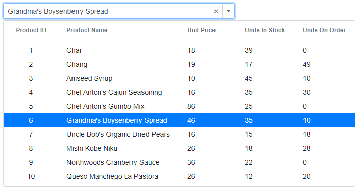
}After executing the previous code examples, we’ll get output like the following screenshot. See how it displays the ComboBox list items information in the multicolumn view.
Display customized information
Now, we can display the custom text alignment in each column using a built-in class, like in the following code example:
- e-text-center: Displays the text in center of the column.
- e-text-right: Displays the text in right side of the column.
- e-text-left: Displays the text in left side of the column.
<HeaderTemplate>
    <table><tr><th class="e-text-center">Product ID</th></tr></table>
</HeaderTemplate>
<ItemTemplate>
     <table><tbody><tr><td class="e-text-center">@((context as Product).ProductID)</td></tr> </tbody></table>
</ItemTemplate>
Conclusion
I hope you can now add and display a multicolumn view in the ComboBox drop-down. You can easily customize the pop-up and list the items using the template option, which you can learn more about from this demo.You can download the complete source code of this example from the GitHub repository.
Try our Blazor ComboBox component by downloading a free 30-day trial or see our NuGet package. Feel free to have a look at our online examples and documentation to explore other available features.
If you have any questions, please let us know in the comments section below. You can also contact us through our support forum, Direct-Trac, or feedback portal. We are always happy to assist you!


Comments (5)
Really looking forward to doing the example – but the code link to GitHub does not work
Hello D E,
Thank you for your feedback, now the GitHub sample is accessible.
Regards,
Saravanan G
This is really, really nice! Any chance that all columns are searchable like the AutoComplete?
Hello Anthony,
Yes, we can search text in all columns with the filtering feature. You can enable the AllowFiltering property and make custom filtering with the Filtering event.
Please find the below update sample – https://github.com/SyncfusionExamples/blazor-multi-column-combobox
Regards,
Saravanan G
In .net 8 it is throwing error due to context, so by declaring it with ItemTemplate it solved the issue.
Comments are closed.