How Vue Components Work (Examples & Step-By-Step Tutorial)
In a rush? Skip to Vue component examples.
With the latest version of our shopping cart built on top of Vue.js, I think it’s fair to say we’ve mastered this framework in the last few months.
And we still love it as much as the first day.
But we had to work our asses off to learn the ins and outs of Vue. Not that it’s a very complex beast. The learning curve is actually quite smooth. It’s simply that doing things the right way takes time.
That’s why we pride ourselves in crafting content that might help devs going down the same road we did.
We’ve written about state management, render functions and PWA development (amongst other Vue-related matters).
Today, it’s all about Vue components. Starting from the basics, here’s what I’ll cover:
What is a component?
What are the building blocks of a Vue component?
How to use them?
And I’ll finish it off with examples of Vue components in the wild!
No more time to waste; let’s dive right in!
What is a Vue component?


A component is a self-contained, reusable, most often single-responsibility, piece of UI logic.
Even though I’m using the wording “Vue component” here, it’s important to know that components aren’t specific to Vue.
Yes, Vue.js is what we call a “component framework”. But so is React, as well as the new kid on the block, Svelte.
The “component” approach is a way of structuring frontend development in a way that doesn't bloat the development experience. Most component frameworks have reactivity at their core, which benefits user experience without sacrificing ease of use by developers.
Each component can have its own state, markup, and style. The real magic lies in the fact that you can reuse a component as many times as you want. It then allows developers to build app organized into a tree of nested components:

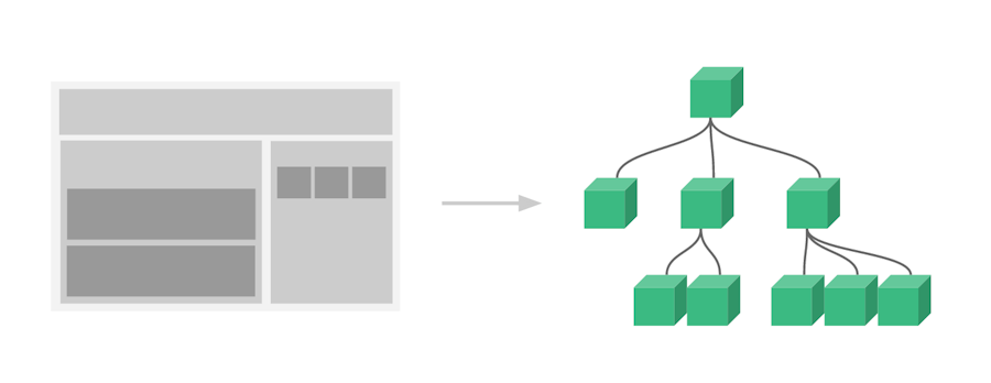
Image is taken from Vue.js official docs
You can probably imagine the amount of time saved by using this approach.
There are already hundreds of existent components out there that you can quickly import to your projects to perform simple to more complex tasks. You can find a comprehensive list on vuecomponents.com.
I’m over-simplifying the concept for now. You need to know that there are different types of components, which we’ll explore with examples further down.
First, let’s see what’s hiding inside these components.
The building blocks of a Vue.js component
When coding a component in a .vue file at the most basic level, you’ll find three sections available to put code in:

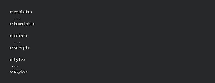
Template. Written in an augmented version of the templated language (HTML), it serves as a directive to the framework on how to produce the final markup of the component based on its internal state.
Script. Where the logic of the app resides. In that section are input low-level concepts such as:
Properties: A set of input variables used to configure a component's behavior. Properties are provided by the host application or by a parent component. They can be data filters, sort orders, labels, visibility switches, etc.
State: This one’s optional but often present. This is a data structure that provides the state of a component at a given time. The state of a component will change over time based on occurring events (clicks, scroll, DOM mutations).
Style. Where the CSS is placed.
Pretty simple right? A component in itself is indeed very straightforward. However, components then become building blocks for your whole app themselves. That’s where it can get a bit more complicated.
But don’t worry, I’ve got you covered.
How to use components?
Components always have a name defined. This is what the Vue compiler looks for to know where to create and mount component instances. When you want to use a component in a template, just create an HTML tag named after your component.
The easiest way to register components is to do it globally using the Vue.component method. When registered globally, they can be used anywhere in the component tree of your app.
Take the following snippet as an example:
// This is the global component registrations
Vue.component("spinning-text", {
  props: { speed: { type: String } },
  template: '<span :class="speed"><slot /></span>'
});
Vue.component("bad-ux-button", {
  template:
    '<button>💥<spinning-text speed="ultra-fast">Do the thing</spinning-text>💥</button>'
});

// This is where we create the instance of your root Vue app
new Vue({ el: "#bad-ux-app" });
As you can see, we don’t need to do anything fancy to use spinning-text within the template of bad-ux-button. It just works.
However, for larger-scale production scenarios, it is advised to use local registration so that build tools can code split the app, thus enabling lazy loading of components. This can significantly improve the bundle size and runtime load of your app.
Vue component tutorial (with useful examples)
In this section, I’ll cover the typical ways of defining components and using them in your pages. I’ll take a look at:
Inline (or basic) components
Single file components
Functional components
1. Basic components
Let’s start with a couple of tiny components, each given a single responsibility.
Say, for instance, that you have a legacy app where people can edit stuff. At some point, you realize people are often accessing and saving entries concurrently, overwriting other people’s edits from time to time.
You decide that a small stepping stone to prevent this from happening would be to notify people visually when somebody else is viewing the entry they’re on. You find some WebSocket library and set up the necessary plumbing to notify concurrent connections.
Something like this:
Now, Let’s take a look at how we could implement the frontend of this scenario using a small Vue component.
We’ll need two components, actually: viewers-list and viewer-badge.
The viewer-badge component will be as simple as this:
// index.js
Vue.component("viewer-badge", {
  template: `
    <transition name="fade">
      <img
        class="viewer-badge"
        :src="userInfo.avatar"
        :alt="userInfo.name" />
    </transition>`,
  props: { userInfo: { type: Object, required: true } }
});


// styles.css
.viewer-badge {
  border: solid 5px lightblue;
  margin: 5px;
}
.fade-enter-active,
.fade-leave-active {
  transition: opacity 0.4s, transform 0.4s;
}
.fade-enter,
.fade-leave-to {
  opacity: 0;
  transform: scale(0, 0);
}
Few things to note here:
The component receives a
userInfoproperty that is used to render the templateWe are using a Vue transition wrapper component so that badges come and go in a smooth way
Our component’s style is located in a separate file. This may not seem noteworthy, but it will make sense by the end of the post, promise!
Here we’ll pretend our live update mechanism mutates a globally available array named concurrentViewersFromWebSockets.
Let’s now register the viewers-list component:
// index.js
Vue.component("viewers-list", {
  template: `
    <div>
      <viewer-badge
        v-for="viewer in viewers"
        :info="viewer"
        :key="viewer.id" />
    </div>`,
  data() {
    return { viewers: concurrentViewersFromWebSockets};
  }
});
The important bits:
Our
datafunction creates a reactive property in the state based on theconcurrentViewersFromWebSocketsglobal array.Since we are using a
v-fordirective in the template, every change to the reactive array’s content will cause a re-render of our component.
Finally, we put a viewers-list instance inside an element of the page and mount the Vue app on it:
// index.html
<div id="viewers-app">
  <viewers-list></viewers-list>
</div>


// index.js
new Vue({ el: "#viewers-app" });
That’s pretty much it! You've seen the result above (we’re randomly simulating colleagues coming and going).
Now, this way of defining components is excellent when you simply drop Vue in an existing project to add helpful features. However, when building a whole new app based on Vue.js, the provided tooling makes for an even better developer experience.
Enter Vue single file components!
2. Single file components
When booting a project with Vue CLI, you’ll end up with a pre-configured workspace with a neat directory structure and a bunch of packages installed by default. One of them is the Vue loader for Webpack, which enables single file components.
Let’s follow up with a more robust example using components coded inside .vue files.
Say you are building a fun Vue app that is quite addictive. Since you care about people’s productivity and focus, you decide to track how long people are using your app each day and notify them when they reach a certain threshold.
It could look like this:
The threshold in this sample is 30 seconds. You can click the “Dismiss” button to reset the timer.
First, we’ll need a wrapper component that manages the whole timing logic. Here:
// OnSiteTimer.vue
<template>
  <div><slot v-if="triggered" v-bind:timeOnSite="timeOnSite"/></div>
</template>

<script>
export default {
  name: "OnSiteTimer",
  props: { threshold: { type: Number, required: true } },
  data() {
    let timeOnSite = 0;
    const foundCookie = document.cookie
      .split(";")
      .filter(item => item.includes("timeOnSite="));
    if (foundCookie.length) {
      timeOnSite = parseInt(foundCookie[0].split("=")[1], 10);
    }
    return {
      timeOnSite: timeOnSite,
      intervalHandle: null
    };
  },
  computed: {
    triggered() {
      return this.timeOnSite >= this.threshold;
    }
  },
  created() {
    this.intervalHandle = setInterval(this.tick, 1000);
  },
  beforeDestroy() {
    clearInterval(this.intervalHandle);
  },
  methods: {
    tick() {
      if (++this.timeOnSite % 5 === 0) {
        const now = new Date();
        const tomorrow = new Date(
          now.getFullYear(),
          now.getMonth(),
          now.getDate() + 1
        );
        document.cookie = `timeOnSite=${
          this.timeOnSite
        };Expires=${tomorrow.toGMTString()};Path=/`;
      }
    }
  }
};
</script>
Let’s run through each relevant section one by one:
The template renders an inner slot only if the threshold has been reached.
The component accepts a
thresholdproperty that is used to know if the inner slot must be shown, depending on the elapsed time.The
datafunction exposes atimeOnSitevalue that will increment over time. Not that we retrieve an initial value for it from browser cookies. We’ll get to that.We also store an
intervalHandlein the state. This is used to prevent memory leaks when our component gets destroyed. It is used in thecreatedandbeforeDestroylifecycle hooks.We have a
triggeredcomputed property that indicates if the threshold has been reached.In the
createdlifecycle hook, we register thetickmethod as a callback to a 1000ms interval.The
tickmethod incrementstimeOnSiteby 1 second. It also flushes the current timer value to the browser cookies every 5 seconds so we can track how much time people spend on the site across refreshes (resets each day).
And now the call-out message we’ll be displaying when people stay long enough:
// TimeOnSiteCallout.vue
<template>
  <div class="container">
    <p>
      <strong>{{title}}</strong>
    </p>
    <p>
      Hi! You've already spent
      <em>{{formattedTimeOnSite}}</em> on this site today. We strongly believe you should go back to whatever important task you need to get done 😊
    </p>
  </div>
</template>

<script>
export default {
  name: "TimeOnSiteCallout",
  props: {
    title: { type: String },
    timeOnSite: { type: Number, required: true }
  },
  computed: {
    formattedTimeOnSite() {
      let remaining = this.timeOnSite;
      const hours = Math.floor(remaining / 3600);
      remaining = remaining % 3600;
      const minutes = Math.floor(remaining / 60);
      return `${hours} hours ${minutes} minutes and ${remaining % 60} seconds`;
    }
  }
};
</script>

<style scoped>
.container {
  border: 1px solid lightblue;
  padding: 0 0.5em;
}
</style>
You should be familiar with most of what’s used here by now. One thing you can see here is how well organized component development is with single-file components. The template, script, and style sections of our component, all in the same file. Beautiful!
On top of that, by using the scoped attribute on the style tag, the Vue loader guarantees that there is no CSS collision with external styles, thus making your component 100% self-contained.
Let’s put it all together in our root component:
// App.vue
...
<OnSiteTimer
  :threshold="30"
  v-slot:default="slotData">
      <TimeOnSiteCallout
        title="Friendly notice ⏲"
        :timeOnSite="slotData.timeOnSite"/>
</OnSiteTimer>
...
With help from the
v-slotdirective, we are forwarding data exposed to the slot byOnSiteTimerAnything placed within the
OnSiteTimercomponent will be rendered only once the threshold is reached.
And we’re done with this single file component example!
3. Quick word on functional components
For scenarios where performance is critical, and memory optimization is a concern, Vue also offers developers a more low-level way of building components.
Functional components are entirely stateless and do not create any Vue instance. They are basically just a rendering function leveraging Vue’s virtual DOM; data in, markup out!
Although building complete apps with functional components is technically feasible (not without a fair amount of head-smashing, though), the flexibility and ease of use of Vue components largely outweigh these performance gains.
They can be useful in some situations when data just flows through where you judge that a full-blown Vue component is wasted resources.
Closing thoughts
There’s hype over component frameworks at the moment, and trust me, it’s legitimate. Building UI for the web has never been that easy. Part because of the framework itself, but also due to the tooling put in the hands of developers to get started quickly and follow best practices.
We’re big Vue.js proponents here at Snipcart, but if this approach speaks to you, you should check out other great component frameworks like React or Svelte. Find the one that fits your personal needs better!
If you've enjoyed this post, please take a second to share it on Twitter. Comments, questions? Hit the section below!


